Kali Ma
Her name is Kali – She is the Hindu Goddess of Liberation, of change and transition, of endings before beginnings. She is beloved by billions of devotees worldwide, and though you may not know Her by name, you’ve probably seen Her image “hiding in plain sight.” For She inspired Rock ‘n Roll’s most infamous logo.
In 1970 the Royal College of Art in London got a call from the rock n’ roll band, the Rolling Stones’ office. They inquired about students proficient in poster design for their upcoming European tour. An artist who had showed promise in that format was selected and sent to meet the band’s lead singer, Mick Jagger.
John Pasche was 25 at the time and pursuing a Master of Art degree. He remembers, “My design for the tour poster went down well and later in the year Mick invited me to his home to talk about a logo design that he had in mind to use on the Stones own record label.”
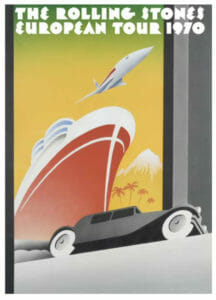
John’s First Commission with The Stones – Europe 70 Tour Poster
Paint It Black
John continues, “During the meeting, Mick explained that he wanted a logo design which would stand alone as an image without including the Rolling Stones name. A bit like the Shell logo for the petroleum company. He also showed me a picture of the Hindu Goddess Kali which he had seen in his local corner shop and asked to borrow it. He just said he liked the image without specifically explaining why. I was conscious that there was a lot of interest in Indian culture and religion at the time.”
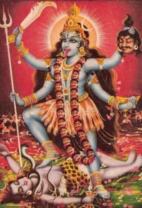
Kali Mata
The two talked through some concepts pulling inspiration from Kali. Pasche explains, “For me it was the tongue sticking out of her mouth that was the spark of the concept of using a disembodied mouth and tongue as the logo. It seemed to symbolize anti-establishment and rebellion which was seen as the bands image at the time”
The art student worked for a few weeks, and presented some preliminary sketches. John retells, “ At the next meeting with Mick, we both agreed on one of the sketches which is very much as the logo is now. He needed to show the rest of the band who were happy for me to proceed to finished artwork.”
The Original Rolling Stones Logo Sketch By John Pasche
Tongue + Lips
John Pasche’s “Tongue and Lips” logo first appeared on the back cover, inside cover and label of the 1971 Rolling Stones’ album Sticky Fingers. A record that frequently ranks on “best of” lists. It contains Stones classics like, “Brown Sugar,” Wild Horses,” “Can’t You Hear Me Knocking,” “Moonlight Mile” and “Dead Flowers.”
Artists Andy Warhol and Craig Braun designed the album cover that contained an actual zipper. They were nominated for a Grammy Award for best recording package in 1972 and are sometimes erroneously credited with having designed the infamous logo.
Stones Travel In Style
Over the last 50+ years the logo has appeared on t-shirts and stickers, stadium stages and private jets, baby clothes and bottles of alcohol, it’s one of the most requested tattoos of all time, and the shape was even built AS a stage at the 2006 Superbowl half time show. It’s regarded as the most recognizable logo in the history of the rock ‘n roll industry.
Of the “Tongue and Lips” phenomena Pasche, now 77 reflects, “I had no idea at the time that my logo design would be used for over 50 years but I put that down to the fact that the band have been making music and touring all that time without wanting to change their logo. I am obviously happy that the logo seems to be liked by young and old. The interest in retro design and fashion has certainly helped.”
She Who Is The Mother Of Time
For being a conduit to one of Kali’s most infamous forms of the modern era, Pasche says, “At the time I didn’t know much about the Goddess Kali but discovered that in Hinduism, she was the goddess of time, doomsday, and death, or the black goddess. Also that she evolved to a full-fledged symbol of Mother Nature in her creative, nurturing and devouring aspects. I wouldn’t be surprised if Mick knew a lot more about this than I did and that is why he chose her image to show to me.”
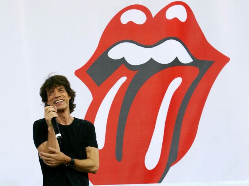
John Pasche with his iconic Rolling Stones Design
Pasche has enjoyed a rich career designing art with music legends like The Who, David Bowie, United Artists Records, Chrysalis Records and more, is a recipient of multiple industry-renown Design and Advertising awards, Music Week awards and Communications Arts awards.
He concludes, “From the day I created the logo I have always felt that it was the perfect image for the Stones and am flattered that a lot of other people like it too.”
Jai Kali Ma!
John Pasche Design
To View John Pasche’s Work Go To JohnPascheDesign.com
To Get Your Own Hand-Signed Rolling Stone’s Logo Art Check Out RollingStonesLogo.com
To Check Out Amy’s Work Go To; Sense + Color, You Can Reach Her At IG: Amy_V_Dewhurst + AmyVDewhurst@SenseAndColor.co #PutYourGoodWhereItWillDoTheMost